Poppi Soda
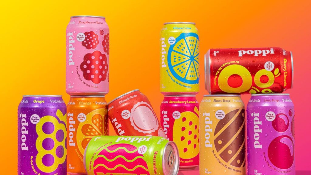
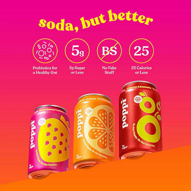
I have never tried Poppi soda myself although their packaging design I am in love with. The very simple graphics each can provides is so eye catching. Their brand uses all sorts of colors but stays unified by using 2-3 colors per can. The simply friendly design can catch the eyes for all different ages. I recently got into packaging design, I always wanted to design something fun and simple, that would ultimately stand out. Poppi is one of the brands I can look to for inspiration in my designs.

Their website as well is also eye catching. It sticks with the bright color scheme of their cans. Their way of advertising is also very modern. On their page there is a lot of motion graphics and gifs, which follows the trend of advertising. Their graphics are short but it is enough to get your attention with the movement.
