Auntie Anne’s Rebrand
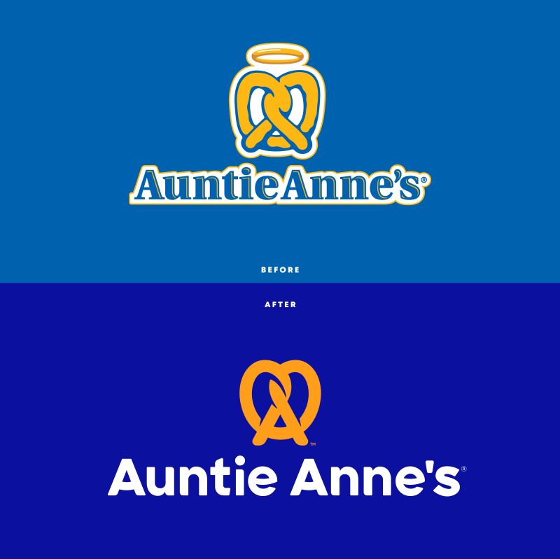
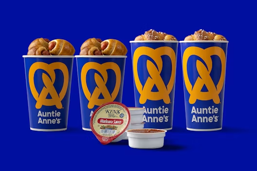
It has been a while since I have been to the mall. Recently I went and got my usual favorite snack. Only to notice that their packaging design was completely different than before. Their rebrand now has a nice deeper blue that I am a huge fan of. They have also modified their logo as well. It is super simple and modern, and they even got rid of the halo on top.

I am all for their new their new rebrand. I am in love with their modern design. In a way it makes the brand look more appetizing. I am not sure if it is the color choice, but the blue and the orange grab my attention a lot more compared to the original design. I will miss the old design because I am just to used to seeing the logo on packaging. I think that brands should eventually go through a rebrand process, just so they do not fall out of the design game.
